Intro
Tableau's vision for data analytics is for any person to have the ability to ask and answer data questions themselves and to easily collaborate. This is a multi-step process involving not only creating visualizations, but also telling a story with the data and sharing with others.
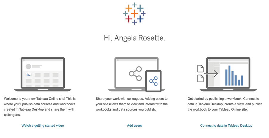
Our original goal was to investigate the Tableau online experience to improve conversion rates for the trial version of the software. Based on our preliminary research, we discovered a theme of pain points with regards to collaboration that prevented people from completing the trial.
Because we wanted to understand more about this experience, including users' processes and pain points when they share and collaborate in data analysis and visualization, our focus pivoted.
Research Pivot
Original Research Question
What aspects of the Tableau Online user experience get in the way of conversion to long-term usage?
Preliminary Research Results
Interviews with users led to a discovery that collaboration in Tableau was a major pain point preventing adoption.
Modified Research Question
How might we support collaboration in the process of data analysis and visualization?
Our Process
Phase 1. Discovery
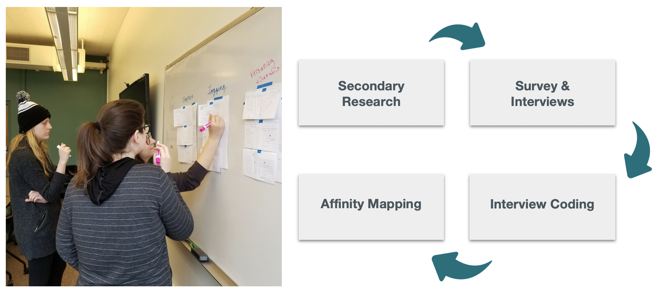
We kicked off our project employing various research methods:
- Secondary research, a heuristic evaluation, and competitive analysis
- Survey sent to Tableau users at University of WA, Amazon and other local companies
- In-person interviews with users recruited from a variety of job fields including designers, business analysts, data scientists, and researchers
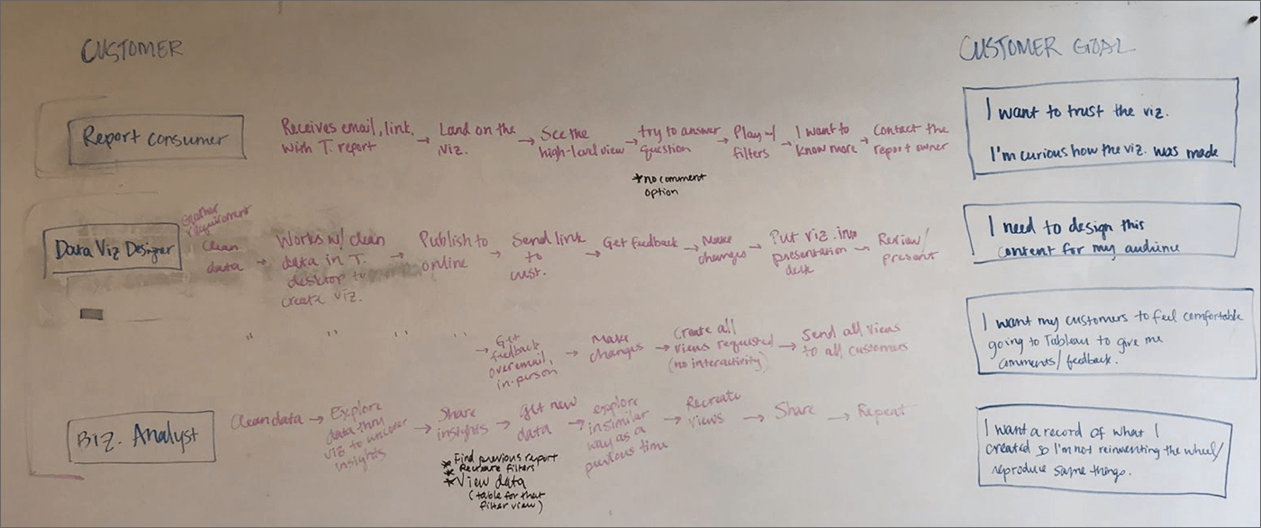
We combined findings from our interviews into summaries and themes of customer experiences. These were catagorized as roles based on their job titles and the tasks they performed at specific stages of their work. From this we developed a customer journey map. User quotes, ideas, and themes were highlighted and sorted.
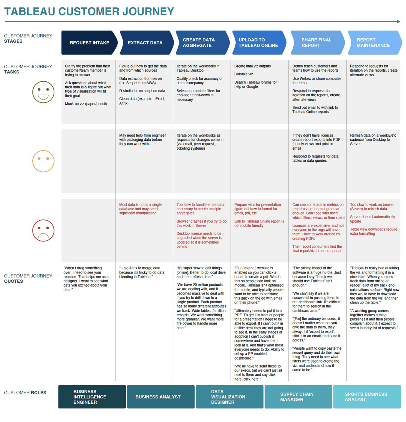
We found that most issues focused on tasks centered around collaboration. Most participants spoke of collaboration in the context of creating visualizations and incorporating feedback from stakeholders. Specifically:
- Sharing the outputs of analysis
- Iterating the design of visualizations
Phase 2. Ideation
In the second phase of our process, we used those two pain points to ideate solutions.
First, we conducted a Design Sprint in which our team reframed the findings as user goals and began to generate and refine possible solutions.
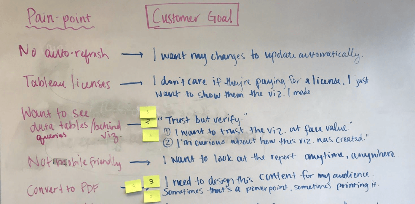
We created a customer goals map. On the left side of the whiteboard, we listed the key users we identified in our research. On the right side, we listed the completed customer goal. Then, we listed the steps and interactions that would take place in between. The map was intended to be kept simple and to serve as another building block for ideation.
Second, we held a Participatory Design workshop in which we asked existing Tableau users to generate and refine possible solutions around these same user goals, anchored in the context of their own experience of sharing and collaborating with data.
"I don't want to have to reinvent the wheel or remember all my actions to recreate the visualization."" Participant 5
"I want my customers to feel comfortable going to Tableau." Participant 1
After the workshop, we reviewed outputs from all of our ideation activities and then affinity diagrammed the solutions.
- We listed each customer goal and the accompanying solution participant’s had ideated
- We coded the solutions based on intent to:
- enable customers to provide feedback
- make them more comfortable using Tableau
- make the designers job easier
After coding, we decided that a hybrid design would be our end product, one which focuses on making the customer feel confident using Tableau by enabling the designer to communicate dashboard features to them.
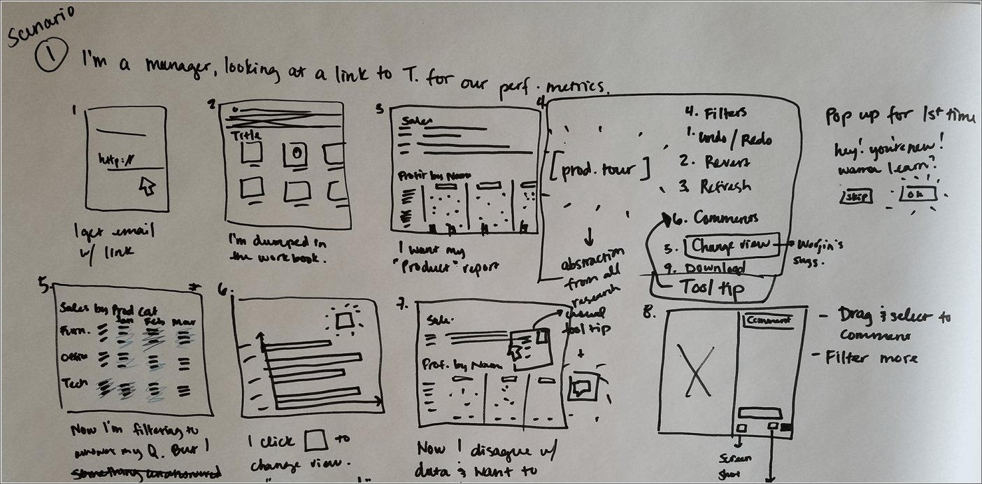
We sketched two user scenarios to address the problematic feedback loop, one from the perspective of the end-user of the dashboard reports (the customer), and the other from the perspective of the designer creating the dashboard reports.

Phase 3. Evaluation
We then created a prototype and conducted two forms of usability testing with users *new* to Tableau:
- Within-subjects A/B testing presenting participants with two different concepts of the Tableau dashboard tour to determine which was preferred and to gather initial impressions and expectations about their usefulness in guiding visualization consumers through a Tableau dashboard interface and the report data
- Blank state usability testing with paper prototypes where participants were asked to imagine how a dashboard author would create a tour for the consumers of the dashboard
Analysis: At the end of the usability testing, we reviewed our qualitative notes from each session, looking for patterns and insights in the answers to our open-ended questions. We highlighted these instances in the raw notes and recorded how frequently certain themes emerged.
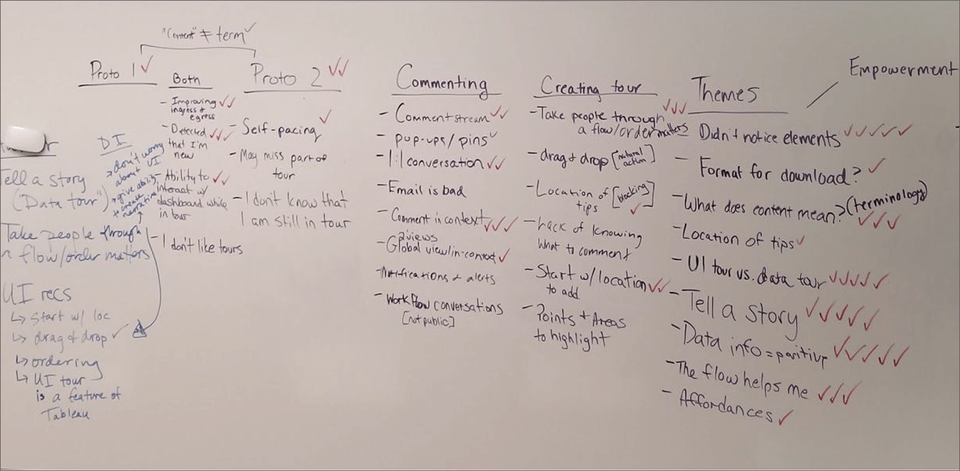
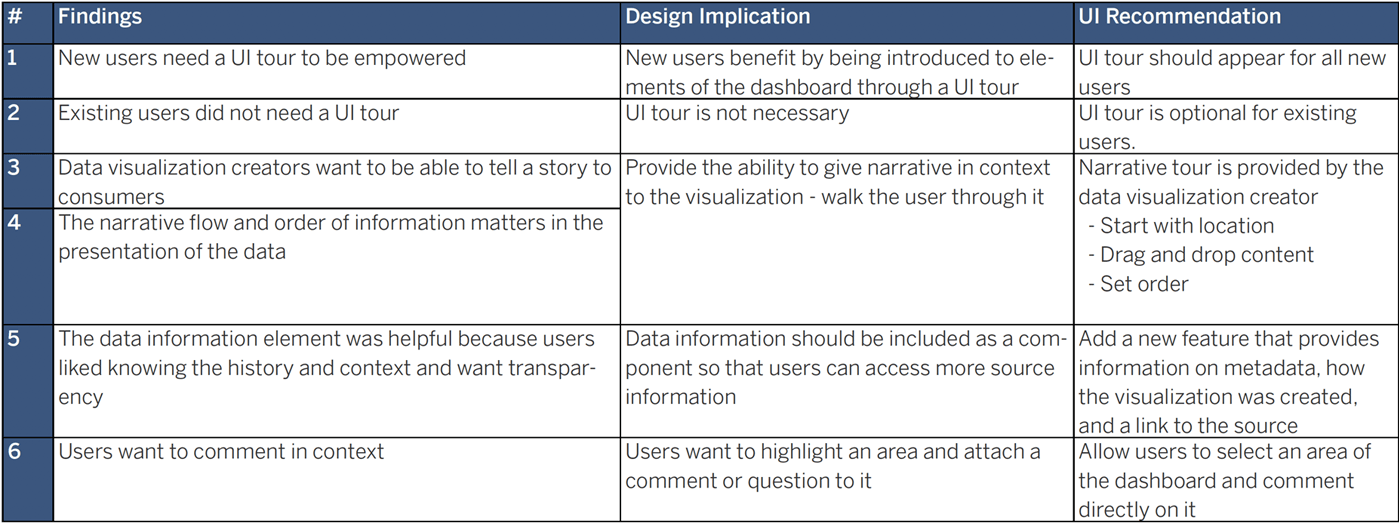
Recommendations and Findings
Based on the results analysis, we charted the top findings and what implications they had on the design. It was obvious that two types of dashboard tour would be helpful to end users:
- one for new users unfamiliar with the Tableau dashboard user interface
- another to provide a narrative of the data for all users
It also became clear that a more robust commenting feature would be helpful to all dashboard users and creators. We used these findings to make recommendations for improving the dashboard tour prototypes.
Outcome
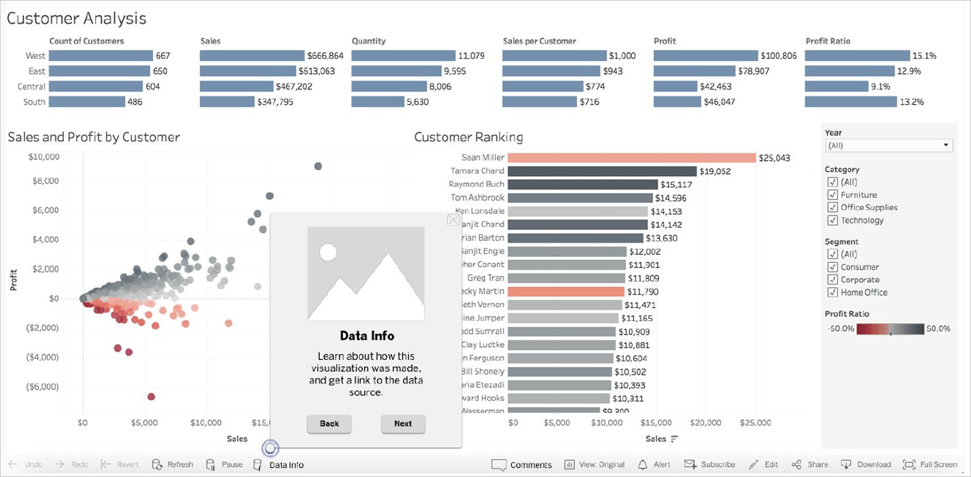
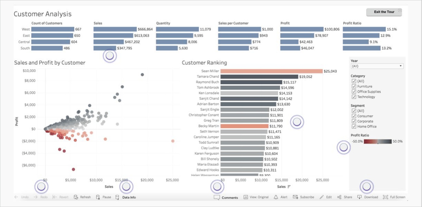
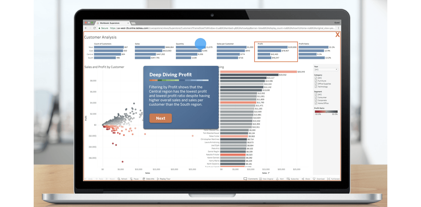
We created a video prototype that included:
- a User-Interface tour to teach new users how to navigate and use features within Tableau dashboards
- a Narrative Design feature that allows dashboard authors to create a story for their data
- a Commenting feature for consumers and authors to communicate in-context
Through prototype testing we found that the UI tour empowered new users to engage more in the dashboard. For authors, it was important to have control over a separate narrative tour. And finally, users wanted to communicate to each other in context, without leaving Tableau.
Video demo of Consumer side prototype
Video demo of Dashboard Author side prototype